
Context
Context
MIC is a cloud-based software that helps Court Appointed Special Advocates, or (CASAs), manage clerical tasks so that they can better support children involved in "children in need of services (CHINS)" cases.
MIC is a cloud-based software that helps Court Appointed Special Advocates, or (CASAs), manage clerical tasks so that they can better support children involved in "children in need of services (CHINS)" cases.
Problem
Problem
CASA volunteers struggled with the report-writing screen due to limited flexibility in autofill, lower discoverability of features, and difficulty referencing case documents, which led to inefficiencies and frustration. The initial design made it harder for volunteers to focus on producing clear, high-quality reports.
CASA volunteers struggled with the report-writing screen due to limited flexibility in autofill, lower discoverability of features, and difficulty referencing case documents, which led to inefficiencies and frustration. The initial design made it harder for volunteers to focus on producing clear, high-quality reports.
Evaluation of Current Screens
Evaluation of Current Screens
Evaluation of Current Screens
We began by mapping out the current user flow, which revealed a long, friction-heavy process with unnecessary steps that slowed users down.
We began by mapping out the current user flow, which revealed a long, friction-heavy process with unnecessary steps that slowed users down.

Figure 1: Current User Flow
Figure 1: Current User Flow
We also conducted usability testing to get data from real CASAs where participants were asked to carry out tasks that involved reaching and using the report-writing screen. In addition to confirmation of the inefficient user flow, it was also revealed that the report-writing screen had many issues of its own. The key takeaways are illustrated below in Figure 3.
We also conducted usability testing to get data from real CASAs where participants were asked to carry out tasks that involved reaching and using the report-writing screen. In addition to confirmation of the inefficient user flow, it was also revealed that the report-writing screen had many issues of its own. The key takeaways are illustrated below in Figure 3.
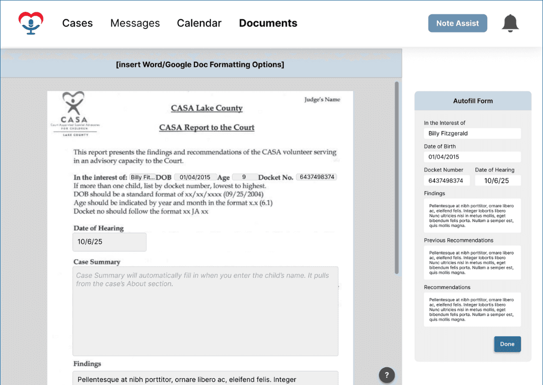


Figure 2: Current Screens for Report Writing
Figure 2: Current Screens for Report Writing

Feature Discoverability
Feature Discoverability
Users had difficulty finding the sidebar with the comments, files, and AI tabs. They could only see it once they had finished the AutoFill.

Inflexibility of AutoFill
Inflexibility of AutoFill
Users noted that there was no way to go back and make changes to the AutoFill once they had pressed the "Done" button.

Referencing Case Documents
Referencing Case Documents
Users wanted a better way to view and reference case files alongside their reports as the current design didn’t support this well.

Lack of Customizability
Lack of Customizability
Users wanted more freedom over the screen real-estate so they could open and close sidebars and choose which view works better for them.
Figure 3: Key Takeaways from Usability Testing
Figure 3: Key Takeaways from Usability Testing
Mission
Mission
Improve the report-writing screen, addressing inefficiencies uncovered in the research phase, by streamlining the writing process, introducing supportive features, and creating a smoother experience that would allow CASA volunteers to focus on producing clear, high-quality reports.
Improve the report-writing screen, addressing inefficiencies uncovered in the research phase, by streamlining the writing process, introducing supportive features, and creating a smoother experience that would allow CASA volunteers to focus on producing clear, high-quality reports.
Design Iterations
Design Iterations
We began by exploring different ideas through individual sketches. The first concept introduced a sidebar for case documents, allowing users to view files while writing reports. A second sketch focused on adjustable panel sizes, giving users control over how much space they dedicate to documents versus the report editor.
We began by exploring different ideas through individual sketches. The first concept introduced a sidebar for case documents, allowing users to view files while writing reports. A second sketch focused on adjustable panel sizes, giving users control over how much space they dedicate to documents versus the report editor.
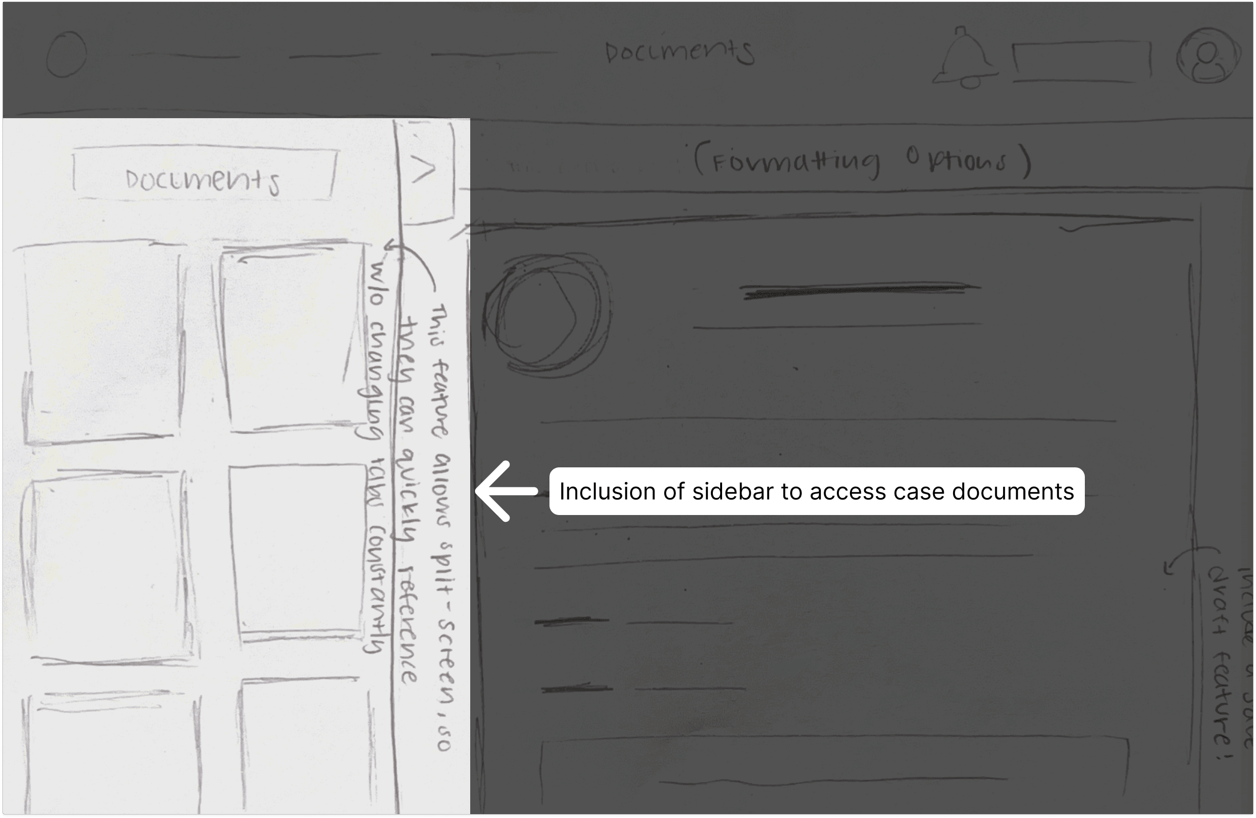
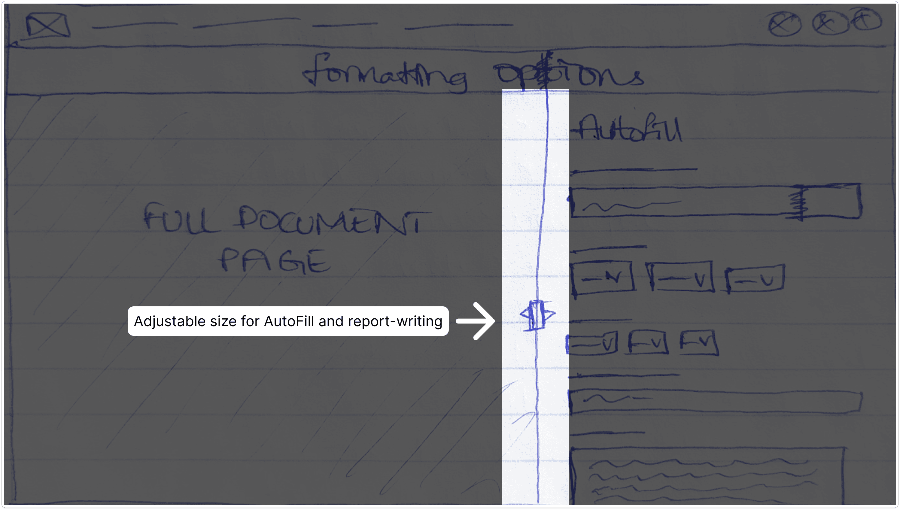
Figure 4: Sidebar for Case Documents
Figure 4: Sidebar for Case Documents
Figure 5: Adjustable Panel Size
Figure 5: Adjustable Panel Size
Figure 4: Sidebar for Case Documents
Figure 5: Adjustable Panel Size
These ideas were then merged during a whiteboarding session, where we combined document access with adjustable layouts into a single screen concept.
These ideas were then merged during a whiteboarding session, where we combined document access with adjustable layouts into a single screen concept.
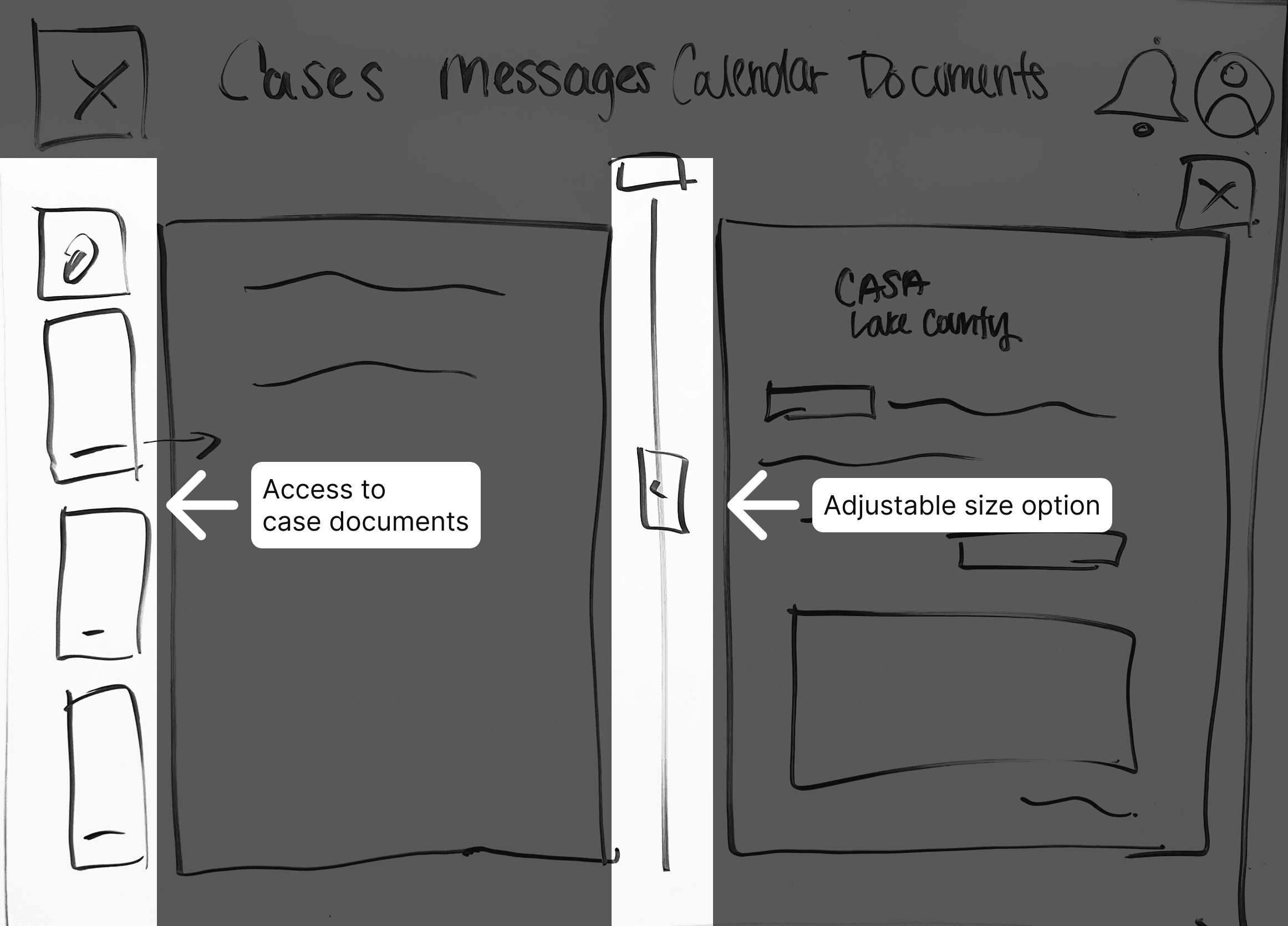
Figure 6: Sketching Ideas Combined in One
Figure 6: Sketching Ideas Combined in One
Building on this, we further refined the experience: instead of allocating screen space to autofill, we shifted it into a pop-up. This freed up room for referencing notes and documents, while keeping autofill accessible and less intrusive. The subsequent wireframes reflected this direction—one showing the autofill pop-up, and the other showing the report-writing screen once autofill was dismissed.
Building on this, we further refined the experience: instead of allocating screen space to autofill, we shifted it into a pop-up. This freed up room for referencing notes and documents, while keeping autofill accessible and less intrusive. The subsequent wireframes reflected this direction—one showing the autofill pop-up, and the other showing the report-writing screen once autofill was dismissed.
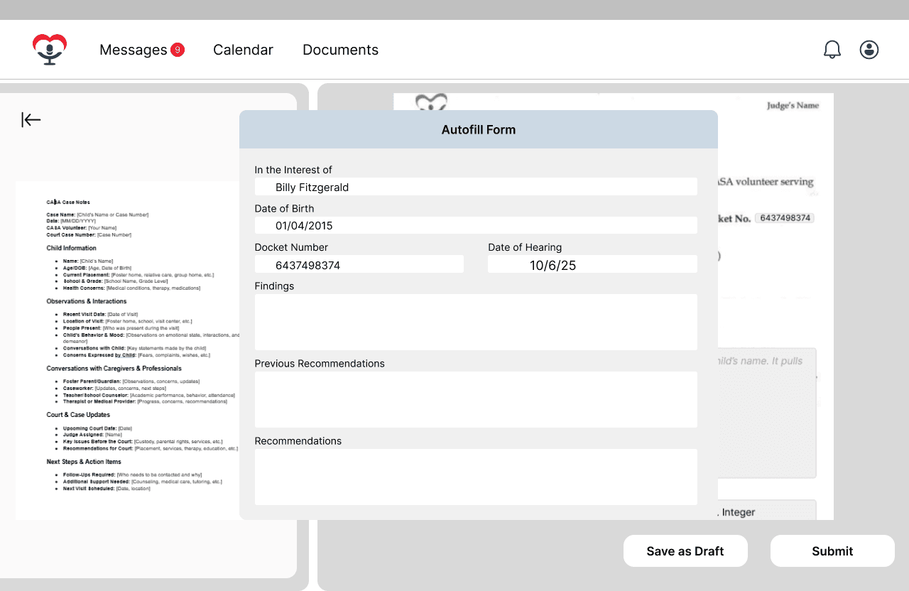
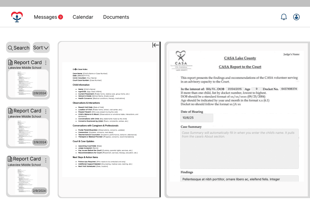
Figure 7: Wireframe for AutoFill Pop-Up
Figure 7: Wireframe for AutoFill Pop-Up
Figure 8: Wireframe from Report-Writing Screen
Figure 8: Wireframe from Report-Writing Screen
Figure 7: Wireframe for AutoFill Pop-Up
Figure 8: Wireframe from Report-Writing Screen
Pivot Point
When presenting these iterations to our sponsor, we were asked to zoom out from just one screen and consider the entire user flow. The goal became simplifying the end-to-end process of writing reports, while ensuring autofill felt intuitive and engaging. This led to a new simplified user flow that is illustrated below.
When presenting these iterations to our sponsor, we were asked to zoom out from just one screen and consider the entire user flow. The goal became simplifying the end-to-end process of writing reports, while ensuring autofill felt intuitive and engaging. This led to a new simplified user flow that is illustrated below.

Figure 9: New User Flow
Figure 9: New User Flow
Round 2 of white-boarding consisted of designing a new universal “Create New Report” button on the homepage. A redesigned autofill pop-up acted as both a loading screen and a decision point where users could skip autofill or confirm it to automatically add insights. Lastly, it introduced a new AI & Comments side panel which allowed users to toggle between comments from supervisors and support from MIC’s AI.
Round 2 of white-boarding consisted of designing a new universal “Create New Report” button on the homepage. A redesigned autofill pop-up acted as both a loading screen and a decision point where users could skip autofill or confirm it to automatically add insights. Lastly, it introduced a new AI & Comments side panel which allowed users to toggle between comments from supervisors and support from MIC’s AI.
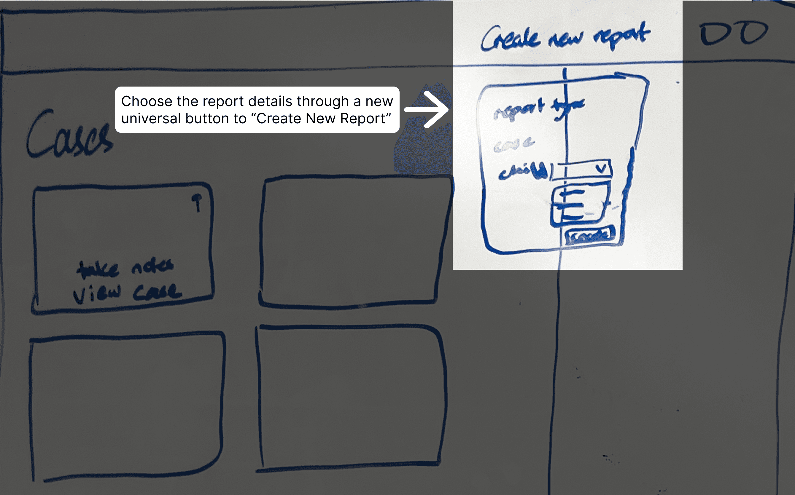
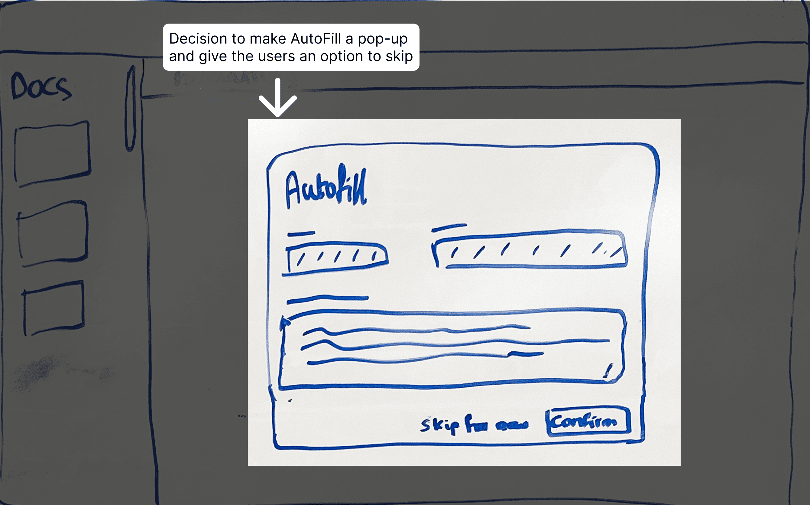
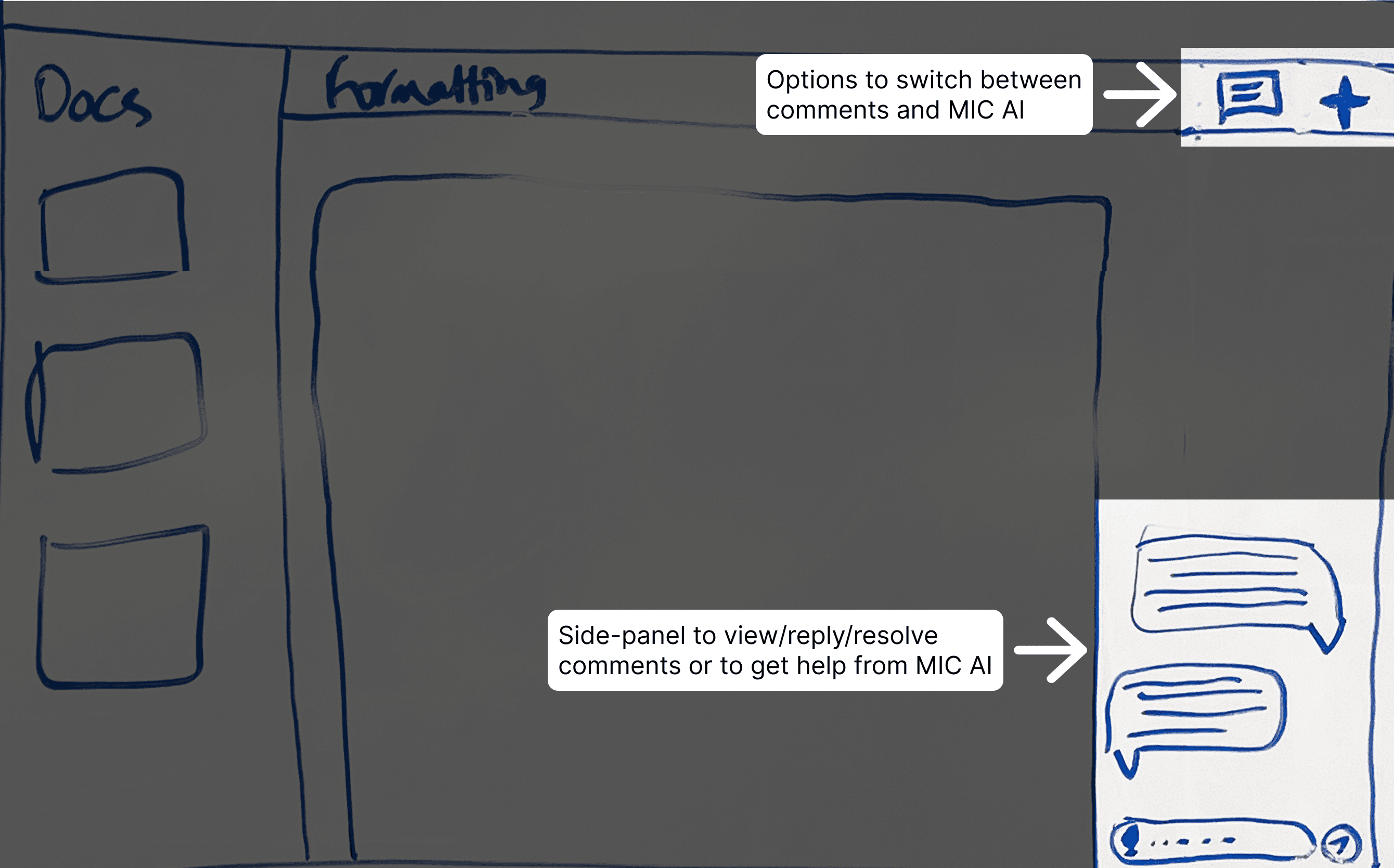
Figure 10: Addition of Universal Button
Figure 10: Addition of Universal Button
Figure 11: AutoFill Pop-Up
Figure 11: AutoFill Pop-Up
Figure 12: Comments & AI Side Panel
Figure 12: Comments & AI Side Panel
Figure 10: Addition of Universal Button
Figure 11: AutoFill Pop-Up
Figure 12: Comments & AI Side Panel
Final Designs
Final Designs
Universal Button to Get Started
Universal Button to Get Started
We introduced a universal button that lets volunteers create a new report by choosing the case, child, and report type in one step, drastically reducing friction. This simple entry point ensures volunteers always know exactly where to begin.
We introduced a universal button that lets volunteers create a new report by choosing the case, child, and report type in one step, drastically reducing friction. This simple entry point ensures volunteers always know exactly where to begin.
AutoFill Loading & Pop-Up
AutoFill Loading & Pop-Up
Volunteers were frustrated when autofill suggestions couldn’t be recovered. We redesigned it as a pop-up, giving clear Skip/Confirm controls and turning it into both a system feedback step and a flexible choice. This keeps automation helpful without taking control away from the user.
Volunteers were frustrated when autofill suggestions couldn’t be recovered. We redesigned it as a pop-up, giving clear Skip/Confirm controls and turning it into both a system feedback step and a flexible choice. This keeps automation helpful without taking control away from the user.
Case Files Panel
Case Files Panel
The left sidebar keeps key documents visible while writing, so volunteers can reference files without breaking focus. It can also be hidden when not needed, giving users flexibility and control over their workspace.
The left sidebar keeps key documents visible while writing, so volunteers can reference files without breaking focus. It can also be hidden when not needed, giving users flexibility and control over their workspace.
MIC AI & Comments Panel
MIC AI & Comments Panel
The right panel combines MIC AI and comments into one space, letting users switch easily between feedback and AI suggestions without leaving the report. This keeps collaboration and support close at hand, streamlining the review and editing process.
The right panel combines MIC AI and comments into one space, letting users switch easily between feedback and AI suggestions without leaving the report. This keeps collaboration and support close at hand, streamlining the review and editing process.
Submission & Draft Options
Submission & Draft Options
Submitting a report is simple and flexible: users can preview and confirm the final document, or save it as a draft to return later. A brief confirmation screen reassures them that their work is complete before returning to the homepage.
Submitting a report is simple and flexible: users can preview and confirm the final document, or save it as a draft to return later. A brief confirmation screen reassures them that their work is complete before returning to the homepage.
Reflection
Reflection
Working on this project highlighted the importance of adaptability in the design process. What began as a focus on one screen evolved into a broader exploration of the workflow, showing me how design must remain flexible to shifting insights and feedback. I also learned the value of creating systems that give users freedom and control, whether through flexible layouts, reversible choices, or supportive tools, so they feel empowered rather than constrained.
Working on this project highlighted the importance of adaptability in the design process. What began as a focus on one screen evolved into a broader exploration of the workflow, showing me how design must remain flexible to shifting insights and feedback. I also learned the value of creating systems that give users freedom and control, whether through flexible layouts, reversible choices, or supportive tools, so they feel empowered rather than constrained.